Noter
Cliquez ici pour télécharger l'exemple de code complet
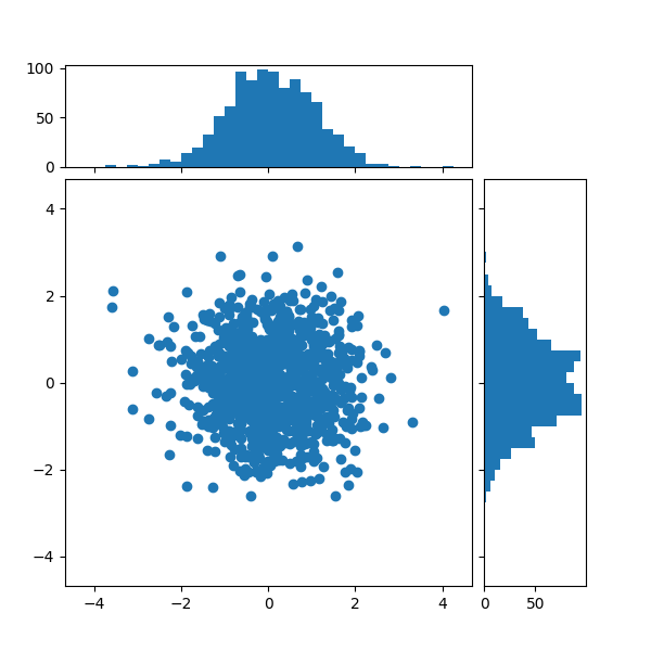
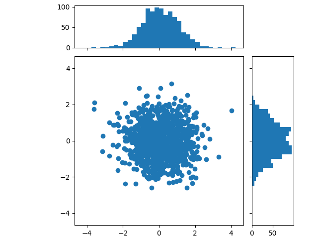
Nuage de points avec histogrammes #
Affichez les distributions marginales d'un nuage de points sous forme d'histogrammes sur les côtés du graphique.
Pour un bel alignement des axes principaux avec les marginaux, deux options sont présentées ci-dessous :
Bien que Axes.inset_axespeut-être un peu plus complexe, cela permet une gestion correcte des axes principaux avec un rapport d'aspect fixe.
Une méthode alternative pour produire une figure similaire à l'aide de la boîte à axes_grid1
outils est illustrée dans l' exemple d' histogramme de dispersion (axes localisables)
. Enfin, il est également possible de positionner tous les axes en coordonnées absolues à l'aide de Figure.add_axes(non représenté ici).
Définissons d'abord une fonction qui prend les données x et y en entrée, ainsi que trois axes, les axes principaux pour la dispersion et deux axes marginaux. Il créera ensuite la dispersion et les histogrammes à l'intérieur des axes fournis.
import numpy as np
import matplotlib.pyplot as plt

# Fixing random state for reproducibility
np.random.seed(19680801)

# some random data
x = np.random.randn(1000)
y = np.random.randn(1000)


def scatter_hist(x, y, ax, ax_histx, ax_histy):
    # no labels
    ax_histx.tick_params(axis="x", labelbottom=False)
    ax_histy.tick_params(axis="y", labelleft=False)

    # the scatter plot:
    ax.scatter(x, y)

    # now determine nice limits by hand:
    binwidth = 0.25
    xymax = max(np.max(np.abs(x)), np.max(np.abs(y)))
    lim = (int(xymax/binwidth) + 1) * binwidth

    bins = np.arange(-lim, lim + binwidth, binwidth)
    ax_histx.hist(x, bins=bins)
    ax_histy.hist(y, bins=bins, orientation='horizontal')
Définir les positions des axes à l'aide d'un gridspec #
Nous définissons un gridspec avec des rapports de largeur et de hauteur inégaux pour obtenir la disposition souhaitée. Voir également le didacticiel Arranger plusieurs axes dans une figure .
# Start with a square Figure.
fig = plt.figure(figsize=(6, 6))
# Add a gridspec with two rows and two columns and a ratio of 1 to 4 between
# the size of the marginal axes and the main axes in both directions.
# Also adjust the subplot parameters for a square plot.
gs = fig.add_gridspec(2, 2,  width_ratios=(4, 1), height_ratios=(1, 4),
                      left=0.1, right=0.9, bottom=0.1, top=0.9,
                      wspace=0.05, hspace=0.05)
# Create the Axes.
ax = fig.add_subplot(gs[1, 0])
ax_histx = fig.add_subplot(gs[0, 0], sharex=ax)
ax_histy = fig.add_subplot(gs[1, 1], sharey=ax)
# Draw the scatter plot and marginals.
scatter_hist(x, y, ax, ax_histx, ax_histy)
Définir les positions des axes en utilisant inset_axes #
inset_axespeut être utilisé pour positionner les marges en dehors des axes principaux. L'avantage de le faire est que le rapport d'aspect des axes principaux peut être fixe, et les marges seront toujours dessinées par rapport à la position des axes.
# Create a Figure, which doesn't have to be square.
fig = plt.figure(constrained_layout=True)
# Create the main axes, leaving 25% of the figure space at the top and on the
# right to position marginals.
ax = fig.add_gridspec(top=0.75, right=0.75).subplots()
# The main axes' aspect can be fixed.
ax.set(aspect=1)
# Create marginal axes, which have 25% of the size of the main axes.  Note that
# the inset axes are positioned *outside* (on the right and the top) of the
# main axes, by specifying axes coordinates greater than 1.  Axes coordinates
# less than 0 would likewise specify positions on the left and the bottom of
# the main axes.
ax_histx = ax.inset_axes([0, 1.05, 1, 0.25], sharex=ax)
ax_histy = ax.inset_axes([1.05, 0, 0.25, 1], sharey=ax)
# Draw the scatter plot and marginals.
scatter_hist(x, y, ax, ax_histx, ax_histy)

plt.show()
Références
L'utilisation des fonctions, méthodes, classes et modules suivants est illustrée dans cet exemple :
Durée totale d'exécution du script : (0 minutes 1,217 secondes)