Noter
Cliquez ici pour télécharger l'exemple de code complet
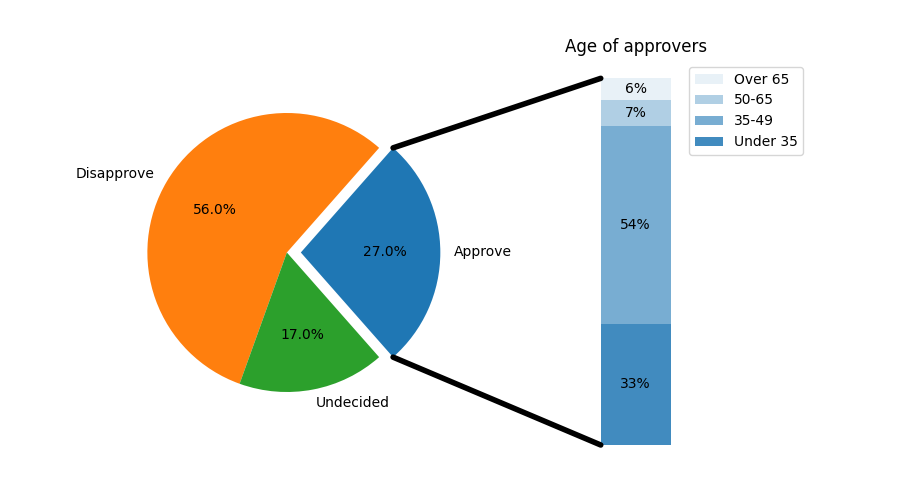
Barre de tarte #
Créez un graphique en "barre de tarte" où la première tranche de la tarte est "explosée" dans un graphique à barres avec une ventilation supplémentaire des caractéristiques de ladite tranche. L'exemple illustre l'utilisation d'une figure avec plusieurs ensembles d'axes et l'utilisation de la liste des correctifs d'axes pour ajouter deux ConnectionPatches afin de relier les graphiques de sous-parcelles.
import matplotlib.pyplot as plt
from matplotlib.patches import ConnectionPatch
import numpy as np

# make figure and assign axis objects
fig, (ax1, ax2) = plt.subplots(1, 2, figsize=(9, 5))
fig.subplots_adjust(wspace=0)

# pie chart parameters
overall_ratios = [.27, .56, .17]
labels = ['Approve', 'Disapprove', 'Undecided']
explode = [0.1, 0, 0]
# rotate so that first wedge is split by the x-axis
angle = -180 * overall_ratios[0]
wedges, *_ = ax1.pie(overall_ratios, autopct='%1.1f%%', startangle=angle,
                     labels=labels, explode=explode)

# bar chart parameters
age_ratios = [.33, .54, .07, .06]
age_labels = ['Under 35', '35-49', '50-65', 'Over 65']
bottom = 1
width = .2

# Adding from the top matches the legend.
for j, (height, label) in enumerate(reversed([*zip(age_ratios, age_labels)])):
    bottom -= height
    bc = ax2.bar(0, height, width, bottom=bottom, color='C0', label=label,
                 alpha=0.1 + 0.25 * j)
    ax2.bar_label(bc, labels=[f"{height:.0%}"], label_type='center')

ax2.set_title('Age of approvers')
ax2.legend()
ax2.axis('off')
ax2.set_xlim(- 2.5 * width, 2.5 * width)

# use ConnectionPatch to draw lines between the two plots
theta1, theta2 = wedges[0].theta1, wedges[0].theta2
center, r = wedges[0].center, wedges[0].r
bar_height = sum(age_ratios)

# draw top connecting line
x = r * np.cos(np.pi / 180 * theta2) + center[0]
y = r * np.sin(np.pi / 180 * theta2) + center[1]
con = ConnectionPatch(xyA=(-width / 2, bar_height), coordsA=ax2.transData,
                      xyB=(x, y), coordsB=ax1.transData)
con.set_color([0, 0, 0])
con.set_linewidth(4)
ax2.add_artist(con)

# draw bottom connecting line
x = r * np.cos(np.pi / 180 * theta1) + center[0]
y = r * np.sin(np.pi / 180 * theta1) + center[1]
con = ConnectionPatch(xyA=(-width / 2, 0), coordsA=ax2.transData,
                      xyB=(x, y), coordsB=ax1.transData)
con.set_color([0, 0, 0])
ax2.add_artist(con)
con.set_linewidth(4)

plt.show()
Références
L'utilisation des fonctions, méthodes, classes et modules suivants est illustrée dans cet exemple :